Rainbow Cone is a local family-owned business in the heart of Chicago, serving communities their signature ice cream cones since 1926. The company is famous for its creative combination of ice cream flavors, with a heartfelt origin story that all starts with “Grandpa Joe” and his wife Katherine.
Services Utilized
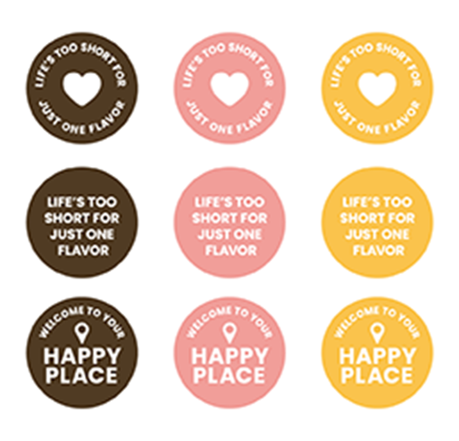
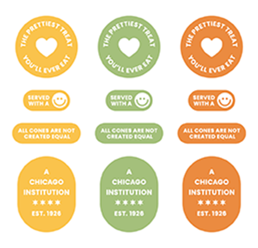
With their company illustrated by their family traditions and signature ice cream, Rainbow Cone came to our marketing team with help to structure a brand identity, website development, sign and package design, photography, and social media management.
 Overview
Rainbow Cone is a family-owned legacy company delivering unique and quality ice cream flavors to the Chicago community for over 95 years. Their signature five-in-one ice cream flavor combination is a unique feature met with an exclusive serving technique that hasn’t been done anywhere else.
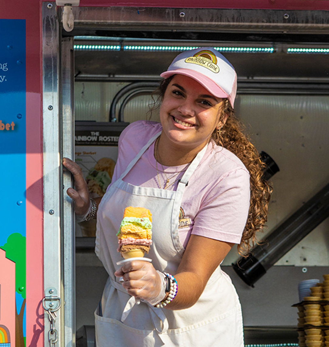
Rainbow Cone’s original signature ice cream cone features five delicious flavors – chocolate, strawberry, Palmer House, pistachio, and orange sherbet that are sliced (not scooped) into one deliciously flavorful cone.
 Challenge
As the trusted and beloved ice cream shop in Chicago, Rainbow Cone approached our team with the challenge of evolving their brand to adapt to changing demographics in the area. The client desired a refresh that would resonate with the broader audiences of Chicago while maintaining the essence of their established family style identity.
 Solution
With an established, one-of-a-kind product that delivers both looks and taste, our branding team worked on a brand identity that would uphold the unique features and family values that Rainbow Cone represents.
A Dynamic and Delicious Brand Identity
Champ’s creative team aimed to establish a brand identity that was timeless and traditional to the Rainbow Cone’s family origin. We wanted the branding to highlight the almost 100 years of ice cream while inviting a wider audience to engage and enjoy the brand.
Our branding team strategized an identity that reflected Rainbow Cone’s commitment to timeless moments – Sharing with our community the taste and experience of the iconic 5-flavor ice cream cone that’s made with joy and served with a smile. Tying in the family history of this Chicago-based ice cream shop, our branding team created the tagline, Ice cream sliced with a smile since 1926.
All marketing and copywriting assets delivered to Rainbow Cone followed the newly established branding guidelines.
This new group of fonts was chosen to represent a traditional yet energetic brand. The brand voice is approachable and inviting and reflects an enthusiastic, charming, and friendly tone. The branding color palette represents each of the five flavors of Rainbow Cone’s signature ice cream cone.
Our design team created a new logo for Rainbow Cone that reflects the longstanding history of the company’s identity and how the brand is adapted toward with a more modern twist.
Playful New Package & Print Design
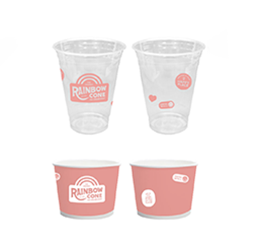
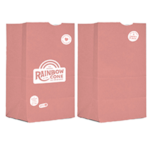
With new colorful and flavorful branding guidelines, we worked with Rainbow Cone to create an engaging packaging and print design to follow.
Our print and packaging team worked on a package design that would reflect a modern aesthetic on the store shelves while maintaining the nostalgic elements cherished by their loyal customer base.
This included designing menus for the ice cream shop’s drive-thru and in-store menus, as well as printed menus for pop-up tents and events. Our design team also created new packaging for Rainbow Cone’s Cake Boxes and to-go products.
Branded merchandise like t-shirts, stickers, and hats were revamped with this new branding, and quickly became favored by their loyal customers!
Enchanting Retail Signage
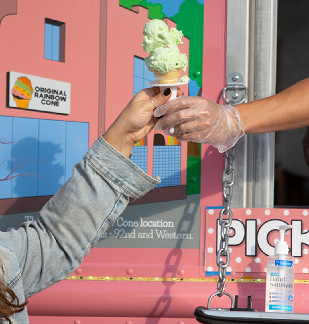
In the essence of Rainbow Cone’s new design and branding identity, Champ also designed exterior signage that would reflect their brand and reach a wider audience.
Our agency created a refreshing and captivating physical presence that echoed the vibrant colors and friendly identity of Rainbow Cone. This signage decorated the exterior of this Chicago ice cream shop!
Transforming a User-Friendly Online Experience
Rainbow Cone’s website also underwent a complete redesign to enhance user experience and align with this new and friendly brand identity. Our website development team built out a user-friendly design in Rainbow Cone’s vibrant brand colors. A photoshoot with the brand resulted in high-quality photography that they could then use across a variety of marketing materials and channels.
The New Ice Cream Social
With a new deck of vibrant photography, Champ took charge of Rainbow Cone’s social media presence. Our social media management team curated content that reflected the updated branding and images. We strategized social media engagement so Rainbow Cone could get more involved with the Chicago demographic.
 Results
Rainbow Colored Results
The collaboration between Rainbow Cone and Champ resulted in a successfully refreshed brand that appeals to a wider Chicago audience while staying true to the family-owned company’s ice cream traditions. The positive response Rainbow Cone has gained from its existing and new customers reflects its commitment to serving quality ice cream to Chicago communities.
The updated brand identity, packaging, signage, and online presence elevated Rainbow Cone as a contemporary classic in Chicago, continuing to serve their one-of-a-kind ice cream!


