The latest technology era is ever-changing, are you keeping up?
According to a recent Google study, over 60% of online users are making purchase choices quicker than ever before. Most of these purchases are fast-paced decisions – an impulsive click from your company’s Instagram ad, or a curious shopper who stumbled on your website from another social media profile. Here’s the kicker: if your mobile site is slow, cluttered, or confusing, you risk losing 30% of your audience in the blink of an eye.
If you’re reading this, it’s time to revamp your site. Today’s marketing proves that optimizing your mobile site is an absolute must – especially if you want your business to stand out in its success. But fear not, the Champ Digital marketing team is here to help. Check out some of our top go-to tips for optimizing your mobile website.
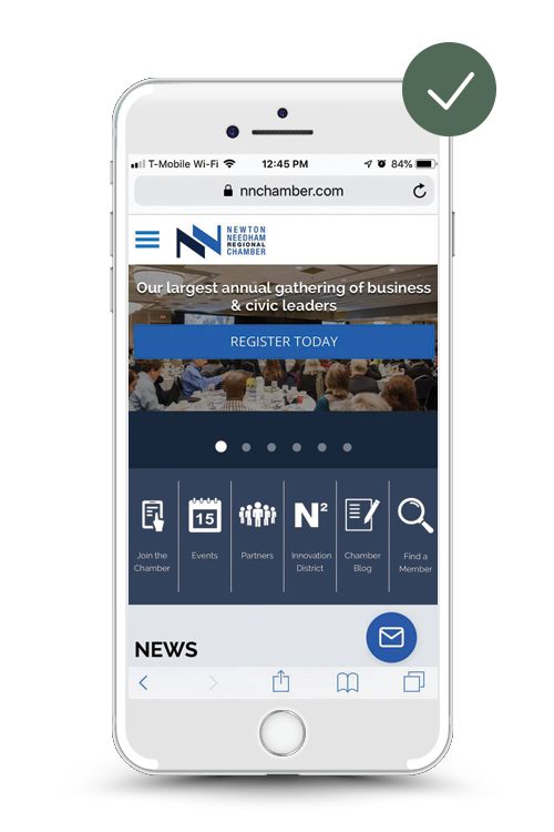
Strategize a Stellar Homepage
Your mobile website’s homepage is like a digital welcome mat. It’s the first impression any new user will have on your site – make it count!
In clear and specific language, make sure your homepage immediately states who your company is and what solution, service, or products you provide to customers. Be loud and proud! Generic prompts like, “Learn More” or “View Now” won’t cut it.
Make your call to action prompts on the homepage to lure users into the exciting information and content your website has to offer – stand out loud and proud!
Additionally, make it effortless for users to return to the homepage at any point throughout the website – this is your “home base” on your website, after all! Many business websites usually put a main logo or prompt at the top corner or center of any website page.
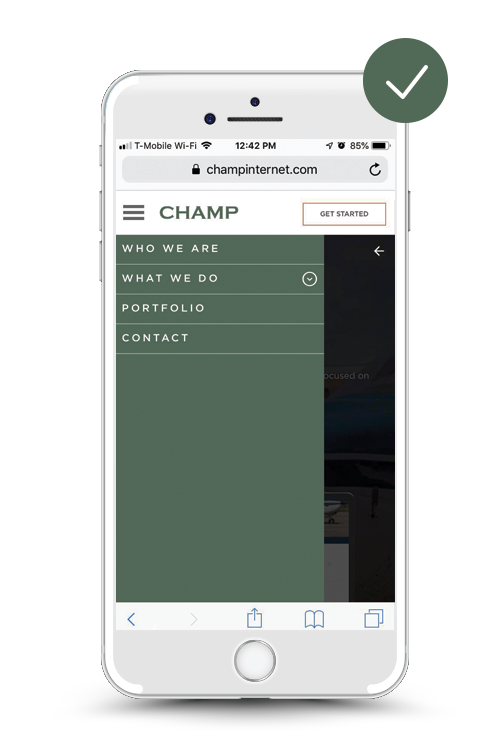
Find Nirvana in Navigation
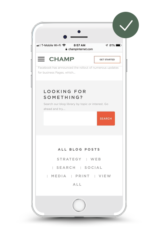
No matter the service or information your business website is providing, effortless navigation is the key to keeping users engaged. To prevent users from excessively scrolling through a never-ending list of options, keep all navigation menus clear and concise.
Based on the information presented in your mobile site’s navigation menu, consider ways to streamline and summarize the menu items.
- Adding a search menu bar on your mobile site is also crucial.
- This search function should be intuitive and easily accessible within the search navigation menu.
- Allow this user-friendly search bar to include filters that auto-complete queries, suggest related terms, and auto-correct spelling errors, all to provide valuable and relevant search results.
- Tools such as Google Custom Search help provide these methods for a more efficient search and navigation experience for users.
Avoid Overwhelming the User
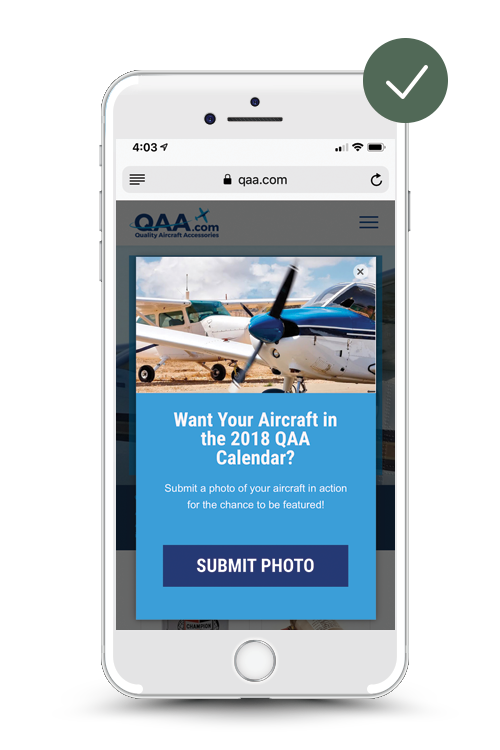
We’ve all entered a mobile site before and have been instantly overwhelmed by all of the pop-up windows and forms requesting registration or information. When hosting a mobile website for your business, don’t be too pushy with collecting data or information from your users.
Google’s Research Team found that website asking for registration right away is a major turn-off for web users. Allow your users to freely explore the wonder of your mobile website without insisting on opportunities for them to opt-in to promotions or registrations.
Instead, many companies are finding ways to prompt users to these sign-up forms in a more natural approach. A clear and bold call to action blurb on a mobile website page will help the user to better read and understand the information you’re requesting, instead of bombarding them with pop-ups and sign-up forms!
Don’t Push It With Promotions
In today’s marketing world, mobile users are savvy enough to see through gimmicky or baseless promotions. Be mindful when integrating promotions on your mobile site. Don’t initiate a frenzy of pop-up prompts for users to download apps or digital assets in exchange for receiving promotions or deals – it will deter them away out of irritation, and ultimately harm your SEO ranking and traffic.
Depending on the business, these mobile promotions could look like:
- Digital downloads (PDFs, infographics, case studies) with information relative to your services or products
- How-to videos, tutorials, or testimonials
- Promotions discounts and deals for newly registered customers
- Activities and opportunities for customer loyalty and engagement (showcasing your purchase, following on social media, sign-up form to attend a local company event)
Instead, strategize compelling content that doesn’t bombard the user as soon as they enter your site. Champ Digital’s experienced marketing team helps clients strategize opportunities for users to receive these campaign promotions in a more inclusive, and less overwhelming way.
Enhancing Every Corner of Your Mobile Website
In conjunction with all of the mobile website tips mentioned above, the most important goal to keep in mind is crafting a seamless user experience from start to finish. This means optimizing the ins and outs of your business mobile website to create a desirable user experience. This can include:
- Incorporating auto-fill capabilities to simplify any digital sign-up form completions.
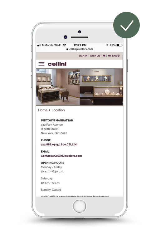
- Fully optimizing your business mobile website with a clear, responsible layout that adapts to all user devices (Laptops, desktops, mobile devices, iPads, etc.)
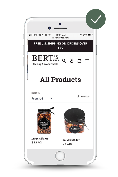
- Making product images expandable for better viewing and incorporating alt text on images for mobile accessibility. High-resolution photography truly makes a difference in product presentation!
As you may have experienced yourself when browsing mobile sites, the best website has everything clearly presented in one place.
Avoid bouncing between pages on mobile websites – if your business offers coupons or promotions, be sure to keep them on your website’s page.
More importantly, in a cautious security world, be clear about the personal information and data you need from users. Transparency is always key! If you need user location information for a more accurate search result on your mobile site, explain so clearly.
Boosting the Mobile Experience: The Bottom Line
When you’re in the process of improving and updating your mobile website, be sure to keep your target audience front and center. Consider your personal experience of browsing mobile websites, what efficient and helpful features stick out for you? What details have been hard to read or make it frustrating to navigate?
A clear navigation menu, intuitive search bar and filters, and less intrusive and more friendly pop-up promotional features are all steps towards setting up your mobile site for success.
Remember, these upgrades for mobile sites may seem daunting, but even the smallest changes and updates can make a world of difference.
In the advanced technology society we find ourselves in today, enhancing and upgrading your mobile website for better user experience and optimization is not a luxury – it’s a necessity.
Luckily, Champ Digital’s decade of digital marketing experience has helped numerous clients achieve better mobile website optimization – increasing web traffic, user engagement, and e-commerce sales as a whole. Through efficient marketing strategy, our SEO and Web Development team is ready to help give your mobile website the revamp it needs!
Contact Champ to learn more about our marketing services and get started today!