The majority of people who visit your website for the first time will likely land on the homepage, which is undoubtedly the most valuable page you’ve got. Too many sites out there are using a carousel that automatically slides content left and right, not knowing that it’s killing their conversion rates. You don’t want to be one of them.
Real quick, let’s clarify what carousels and sliders actually are.
What’s the difference between a carousel and a slider?
A carousel is a revolving set of things (like slides) that either moves on its own or the user can click to put the next thing in motion.
A slider, on the other hand, is a control element that requires the user to click and “slide” the toggle either left and right or up and down. A volume control is probably the best example of this.
For all intents and purposes, however, people typically treat carousels and sliders as one in the same.
Examples of homepage carousels
You’ve likely seen carousels before on your Internet browsing adventures, but here are a few examples sketched by Taj Moore.

Should I use a carousel on my homepage?
No. If you care about engaging and converting users, you should never use a homepage carousel.
In our team’s experience, carousels are a detriment to engagement. 38% of people will stop engaging with a website if the content or layout are unattractive. Animated elements can be downright frustrating, and there are better ways to use that valuable homepage real estate to convert the user. We’ll get to those.
Are homepage carousels effective?
Carousels are effective at forcing lots of content into a small space (thanks to the rotation), and that’s about it.
The University of Notre Dame did a study on the effectiveness of their homepage carousel. Of the 3,755,297 users who hit the homepage, just 1% clicked on one of the slides in the carousel. This click-through rate shows that the carousel is not an effective use of the most valuable space on the homepage. And as you can probably guess, the university’s website is no longer using a carousel.
Why is the homepage carousel bad?
Says growth marketer, Brian Hall, “A carousel is a solution for a committee who can’t decide what to put on the homepage, not a solution for visitors who want to understand and navigate your website. From a user’s perspective, it tends to move just when you want to interact with it.”
Rather than making an example out of a website that’s using a carousel when they shouldn’t be, check out shouldiuseacarousel.com. It demonstrates the frustration many people get. Just as you’ve nearly finished reading the text or you’re about to click on the slide, it’s gone.
And then there’s the issue of accessibility on mobile and for users with disabilities. For an auto-playing carousel (which is most carousels), content that automatically disappears can cause loss of focus for screen reader and keyboard users. The cognitive load and distraction caused by a carousel can be especially difficult for those with cognitive and learning disabilities.
Other reasons to NOT use a carousel on your homepage
Carousels cause banner blindness
Banner blindness is the tendency to ignore or tune out anything on a website that resembles an ad. Carousels can often resemble banner ads, which can cause site visitors to look elsewhere.
Too many choices can result in no action taken
Think about all the cereal options at the grocery store. It can be overwhelming considering there’s an entire aisle dedicated to cereal!
Well, there’s something called the paradox of choice, which stipulates that while we might believe that being presented with multiple options makes our choice easier, the opposite is actually true – having too many options requires more effort and can even make us feel unsatisfied with our choice.
The same goes for the carousel. With all the options (slides), we doubt the choice we clicked. Did I pick the right thing? Was there something better? We might even choose nothing at all.
Carousels slow down your website
Page speed, or page load, is indeed a Google ranking factor – Google rolled out the “Speed Update” in 2018 – and we believe it’s one of the more important factors these days. A carousel typically contains several large images that must be loaded, in addition to needing additional JavaScript to run it. Loading the carousel eats up precious time and it’s not even something people interact with.
3 better alternatives to the homepage carousel
So, what should you use instead of the conversion-killing carousel? Here are a few alternatives for the homepage that we often recommend to our clients.
- Use a static image and a single call to action
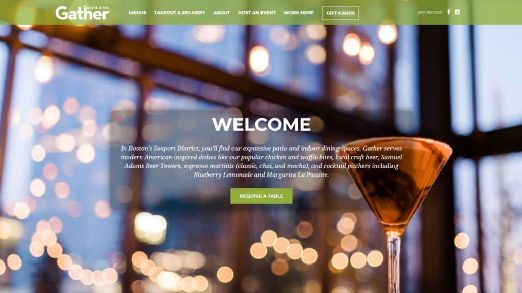
Take Gather as a great example of using a single call to action (CTA). Gather is a restaurant and bar overlooking Boston Harbor, and their main CTA on the homepage is to reserve a table. That’s the single most important thing they want you to do. Chances are that anyone visiting their website is thinking about potentially dining there, and this CTA encourages them to do it.
- Split up the slides into blocks
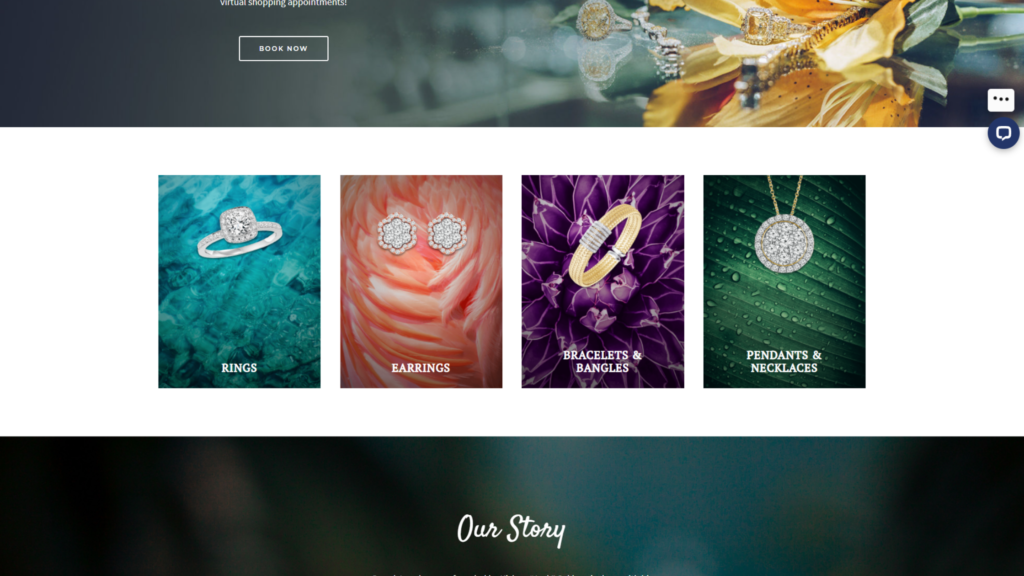
Adam McLaughlin of Fresh Idea Marketing says, “If you were wanting to show off your portfolio in your slider, instead, create sections of your homepage to highlight significant clients, upcoming specials, or popular products.”And this is what Grand Jewelers has done. Rather than forcing several pieces of content into a carousel, their website uses a main banner image with a CTA and then four sections (or blocks) below it that users can also click on. No animation, no frustration, and all their important CTAs are still on the page.
- Use simple messaging and let the user decide where to go
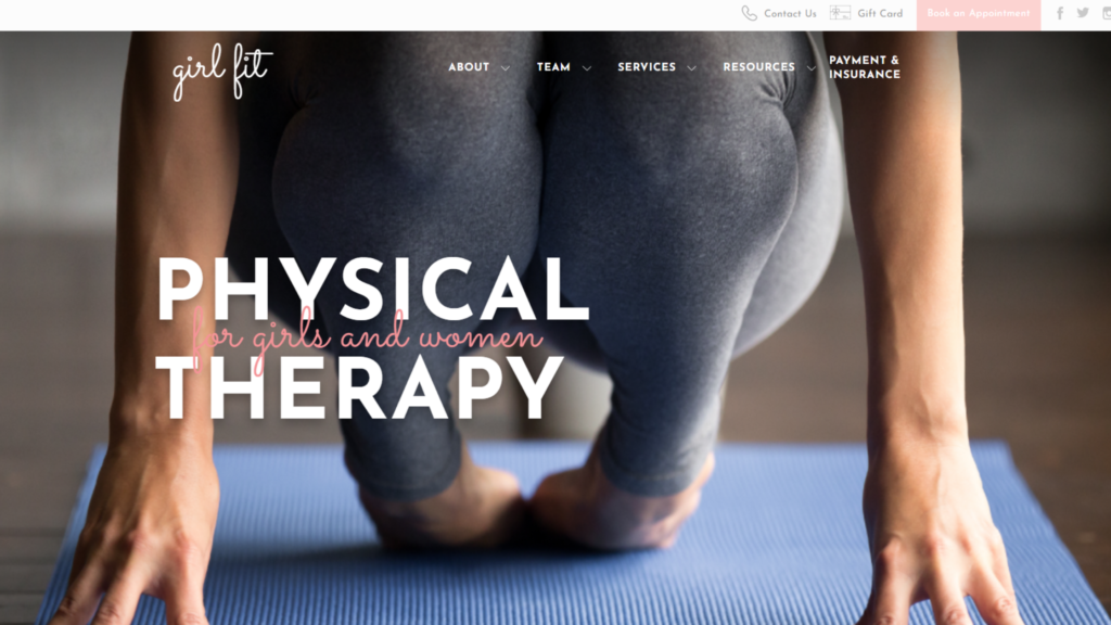
Girl Fit, a physical therapy facility in Newton, MA for girls and women, doesn’t have a main CTA at all. Instead, their homepage uses simple, to-the-point messaging about what their service is. This puts visitors in the driver’s seat without any kind of persuasion – they can go to the main navigation, or they can scroll down the page to explore further.
If you’re thinking about redesigning your homepage, Champ can help
Your website’s homepage is an open invitation for people to explore what you have to offer. Instead of using a carousel that kills your conversion rates, talk to us about designing a homepage that’s both attractive and engaging for your visitors.